
 Photo: iStock
10 rules of influence on buyers with the help of emotions
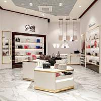
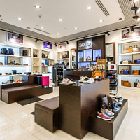
The rules of the game in a supersaturated market are simple: people only buy what attracts their attention. In fact, this means that success among buyers is achieved by brands that have managed to introduce the maximum number of factors to attract attention into the concept of their stores. The science of neuromarketing, founded by German sales specialist Arndt Triindl, helps them in this. This fall, Arndt spoke to Russian retailers at the Retail Business Russia forum and shared with them a number of recommendations on how to turn his store into one continuous focus of customer attention.
 Arndt Triindl - Owner of Retail Branding and founder of neuromarketing. Neuromarketing is a direction in marketing that studies the basics of decision-making and offers ways to influence buying behavior through visual images, sensory experiences and emotions. www.retailbranding.at
The practice of neuromarketing proves that store visitors often make a decision to buy directly at the store, in other words, at a point of sale (POS). That is why the point of sale should be a perfectly thought out “battle map” for the attention of the buyer. Arndt Tryndl developed the so-called POS trilogy, with which the store owner can determine which parts of the store are working poorly in terms of neuromarketing and how to fix it. The technique of working with POS trilogy consists of three stages. First, you need to analyze three key indicators of profitability - attendance, conversion and the average check (which makes up the success of each of these indicators, see figure). Then you should check the concept of your store against a list of security questions and, finally, develop an action plan and implement it.
During his speech at Retail Business Russia, Arndt Trainl gave 10 key recommendations for improving those three metrics: traffic, conversion, and average bill. What are these recommendations?
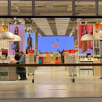
Rules for increasing attendance
The storefront should be bright, memorable and designed in line with the brand’s strategy. Great examples of this rule are usually the facades of freestanding Zara, H&M, or Abercrombie & Fitch stores in major European capitals. Passers-by are also impressed by the mirrored facade of the Tokyo Swarovski store, as if laid out of large crystals. Diesel once designed its Diesel Female store in London with a gold radio with pink buttons, and Adidas built a store in Amsterdam that looks indistinguishable from a taller shoebox. Even temporary measures can be effective: restoring its flagship in Paris, Louis Vuitton designed the repair screens in the form of giant branded suitcases, and the Gap in Vancouver, for the period of its “dizzying sales”, literally turned the front of the store upside down, attached mannequins under the ceiling and thought about the interior as follows: so that the buyer has the complete impression that the world has turned upside down.
Entrance to the store should be wide, well recognizable and inviting to enter. This is especially true of shops in shopping centers. The entrances to the entire width of the store, through which the depth of the trading floor is visible, work best. So in the trading room there are less cold zones, the entrance zone works better, and the buyer does not feel like a fish in the aquarium. You can arrange the entrance to the store so that the process of passing through the door is an adventure for the buyer - as is done in Imaginarium children's goods stores, where there are hotel gates for children.
Showcases should be decorated in a bright, emotional and in accordance with the key idea of the brand. This statement seems like a trite banality, but looking at most stores in Russia, it becomes obvious that few people really follow this rule.
The entrance area should be of interest, but not overload attention. Entrance zones work well in which a certain “history” is demonstrated on the island equipment - for example, a New Year’s collection with the corresponding supporting elements such as mannequins, festive attributes and accessories. At the same time, the depth of the store should be visible behind the entrance zone, so that the buyer’s attention would organically switch to other goods in the store.
Conversion Improvement Rules
Brand values must be translated through store design. For example, in Adidas or Nike stores there are always elements of competition: either decorative medals and pedestals in shop windows, or a miniature basketball court with a ring right in the trading floor, or sports equipment like balls and rackets available for purchase here. Ecco shops are decorated in light colors with trading equipment in a minimalist style, which corresponds to the Scandinavian philosophy, and Timberland shoe stores resemble a men's workshop: they have a lot of wood, rough designs and warm "lamp" lighting. Immersed in the atmosphere of the brand, the buyer unconsciously begins to regard the product as a way to join the values offered to him - of course, if he likes what he sees and feels.

Better less, but better. The less is more principle is one of the most significant in modern merchandising. The overloaded display quickly tires the buyer’s attention, prevents him from focusing on one product and negatively affects sales. It is known that about 5-7 models should be placed on one shelf, and the distance between them should be such that the model can be removed from the shelf, even without slightly hitting other half-parks. Group the product according to similar models, arrange it at an angle of 45 degrees on different shelves and break the monotony and symmetry in other ways.
For more information on how to correctly present quality shoes, see page 64 in the issue of Shoes Report No. 110
Communicate with the buyer and do it in his language. The best things are for those companies that position themselves as living structures in which people also work. No wonder marketing support for brands on social networks is so popular, where brand employees share their observations and everyday pleasures. In physical stores, you can communicate with the buyer using the trading equipment: mark individual products with funny and useful inscriptions, write small notes (“seller on the shelf”) to the groups of goods that you want to highlight, and teach sellers how to communicate with each customer mentally.
Rules for increasing the average check
Complete the presentation with a presentation of accessories. There is nothing easier and more effective than presenting a tone-on-tone belt on a shelf with men's shoes, or complementing evening stilettos with an elegant clutch. So you seem to relieve the buyer of the care of selecting the right accessories and definitely enhance the presentation of each of the proposed products.
Create a feeling of low price. A figured or red price tag, a huge font, a dense “one to one” layout, the presentation of shoes on boxes - these effects create a feeling of cheapness, even if the product has not been discounted. People irrationally react to a low price, so use this technique to draw attention to individual products, even if they are not outsiders of sales.
Keep track of the friendliness of the staff. All your efforts to turn the store into one continuous zone of attention will be in vain if the sellers are not distinguished by friendliness and friendliness. Make your employees love their work and glow with the joy of what they do.
Should a shoe store spend money on digital screens?
Mistakes in the lighting of the sales area that spoil the impression of a shoe store
Technical aspects of display space and current trends in its design
Design rules for a shoe and accessories store
Pandemic-influenced visual merchandising transformation for shoe and accessories store


 We are ready for active development in the Russian market
Friedrich Naumann, CEO of the Tamaris brand, told Shoes Report about the company’s ambitious plans, business development in Russia and expansion of the retail network, and also shared details about new collections and launches.
We are ready for active development in the Russian market
Friedrich Naumann, CEO of the Tamaris brand, told Shoes Report about the company’s ambitious plans, business development in Russia and expansion of the retail network, and also shared details about new collections and launches.
 “Discount for repairs” of clothes and shoes in France supported workshops
The French have calculated the benefits of a program that encourages consumers to repair clothes and shoes by providing discounts on these services in certified workshops. The “repair discount” program began operating in France in November last year. Over the six months of operation of this program, the number of calls to repair shops in France increased 10 times and amounted to 250 repairs. The French saved 000 million euros, writes leparisien.fr.
“Discount for repairs” of clothes and shoes in France supported workshops
The French have calculated the benefits of a program that encourages consumers to repair clothes and shoes by providing discounts on these services in certified workshops. The “repair discount” program began operating in France in November last year. Over the six months of operation of this program, the number of calls to repair shops in France increased 10 times and amounted to 250 repairs. The French saved 000 million euros, writes leparisien.fr.
 Coach turned to Big Data analysis and won the interest of a young audience
American handbag brand Coach has planned the success of its Tabby model among a younger audience, Generation Z, by turning to big data analysis, abandoning traditional and analogue tools, such as human intuition or the ability of any executive to sense “which way the wind will blow,” writes B.O.F.
Coach turned to Big Data analysis and won the interest of a young audience
American handbag brand Coach has planned the success of its Tabby model among a younger audience, Generation Z, by turning to big data analysis, abandoning traditional and analogue tools, such as human intuition or the ability of any executive to sense “which way the wind will blow,” writes B.O.F.
 Why is it so important to work with customer reviews, analyze them and use them in your work?
Customer reviews are of great, invaluable importance when selling a product. However, many companies do not always understand this: they do not collect reviews, respond only to positive ones and do not work with negative ones. This is a big mistake and omission of the brand. In this article, together with SR digital marketing expert Tatyana Vasilyeva, we understand the intricacies and nuances of working with customer reviews and explain why it is worth paying attention to your customer reviews, and how this can increase your sales.
Why is it so important to work with customer reviews, analyze them and use them in your work?
Customer reviews are of great, invaluable importance when selling a product. However, many companies do not always understand this: they do not collect reviews, respond only to positive ones and do not work with negative ones. This is a big mistake and omission of the brand. In this article, together with SR digital marketing expert Tatyana Vasilyeva, we understand the intricacies and nuances of working with customer reviews and explain why it is worth paying attention to your customer reviews, and how this can increase your sales.
 Louis Vuitton opens a new factory in Italy
Louis Vuitton has opened its second shoe factory in Italy. After opening the first one in Fiesso d'Artico in Veneto, the LVMH flagship brand has just opened a new production site dedicated to this category of footwear in the industrial zone of Civitano in the Marche region. There is also another brand production facility in Tuscany, where bags and leather accessories are produced, writes fr.fashionnetwork.com.
Louis Vuitton opens a new factory in Italy
Louis Vuitton has opened its second shoe factory in Italy. After opening the first one in Fiesso d'Artico in Veneto, the LVMH flagship brand has just opened a new production site dedicated to this category of footwear in the industrial zone of Civitano in the Marche region. There is also another brand production facility in Tuscany, where bags and leather accessories are produced, writes fr.fashionnetwork.com.
 The Euro Shoes@CAF exhibition will be held in Almaty
From March 11 to 13, the Euro Shoes@CAF (Central Asia Fashion) exhibition will be held in Almaty at the Atakent exhibition complex. The exhibition, which is the largest international event in the fashion industry in Central Asia, will present collections of clothing, shoes and accessories.
The Euro Shoes@CAF exhibition will be held in Almaty
From March 11 to 13, the Euro Shoes@CAF (Central Asia Fashion) exhibition will be held in Almaty at the Atakent exhibition complex. The exhibition, which is the largest international event in the fashion industry in Central Asia, will present collections of clothing, shoes and accessories.
 New “dutik” from Rick Owens presented at the show in Paris
Strange bulky shoes are another trend of our troubled times, and it’s impossible to ignore. American designer Rick Owens presented voluminous inflated latex boots at a show in Paris, which, according to him, were created in collaboration with the young London designer Straighteye, who likes to experiment with architectural volumes.
New “dutik” from Rick Owens presented at the show in Paris
Strange bulky shoes are another trend of our troubled times, and it’s impossible to ignore. American designer Rick Owens presented voluminous inflated latex boots at a show in Paris, which, according to him, were created in collaboration with the young London designer Straighteye, who likes to experiment with architectural volumes.
 VAGA SHOES is a new participant in the Euro Shoes premiere collection
The Russian women's shoe factory VAGA SHOES will take part for the first time in the international exhibition of footwear and accessories Euro Shoes premiere collection in Moscow.
VAGA SHOES is a new participant in the Euro Shoes premiere collection
The Russian women's shoe factory VAGA SHOES will take part for the first time in the international exhibition of footwear and accessories Euro Shoes premiere collection in Moscow.
 Euro Shoes will start operating on February 19 in Moscow!
The winter session of the international exhibition of footwear and accessories Euro Shoes premiere collection will be held in Moscow at the Expocenter from February 19 to 22. The organizers promise the presence of all the main participants at the exhibition, as well as new names from Europe, Asia and Russia.
Euro Shoes will start operating on February 19 in Moscow!
The winter session of the international exhibition of footwear and accessories Euro Shoes premiere collection will be held in Moscow at the Expocenter from February 19 to 22. The organizers promise the presence of all the main participants at the exhibition, as well as new names from Europe, Asia and Russia.
 American buyers couldn't buy Birkin bags and sued Hermès
French fashion house Hermès is facing a lawsuit in California from two customers who were unable to purchase exclusive Birkin bags. The fashion house is accused of unfair commercial practices.
American buyers couldn't buy Birkin bags and sued Hermès
French fashion house Hermès is facing a lawsuit in California from two customers who were unable to purchase exclusive Birkin bags. The fashion house is accused of unfair commercial practices.
 John Galliano and Christian Louboutin created the Tabi collection for Maison Margiela
Maison Margiela creative director John Galliano and French shoe designer Christian Louboutin released a shoe collaboration that was included in the Maison Margiela Artisanal spring 2024 couture collection. The design duo created six versions of the Tabi shoe. All shoe models in the collection have a split toe - a characteristic touch of the signature Tabi shoe model of the Maison Margiela brand. And Christian Louboutin gave the shoe its signature red sole.
John Galliano and Christian Louboutin created the Tabi collection for Maison Margiela
Maison Margiela creative director John Galliano and French shoe designer Christian Louboutin released a shoe collaboration that was included in the Maison Margiela Artisanal spring 2024 couture collection. The design duo created six versions of the Tabi shoe. All shoe models in the collection have a split toe - a characteristic touch of the signature Tabi shoe model of the Maison Margiela brand. And Christian Louboutin gave the shoe its signature red sole.
 Euro Shoes starts in a month in Moscow!
There is less than a month left before the main exhibition of shoes and accessories in Russia - Euro Shoes Premiere Collection. The event will take place from February 19 to 22 in Moscow at the Expocenter, and, as always, in partnership with the largest international clothing exhibition in Russia, CPM Premiere Moscow.
Euro Shoes starts in a month in Moscow!
There is less than a month left before the main exhibition of shoes and accessories in Russia - Euro Shoes Premiere Collection. The event will take place from February 19 to 22 in Moscow at the Expocenter, and, as always, in partnership with the largest international clothing exhibition in Russia, CPM Premiere Moscow.
 Why Rendez-Vous and Yandex Lavka released a “bread bag”
Shoe retailer Rendez-Vous announced the launch of a spring collaboration with Yandex Lavka and released a roll that resembles the shape of a woman’s handbag. This “Bread Bag” is presented in the Yandex.Lavka application at a price of 249 rubles. On the product packaging there is a promotional code for 1000 rubles, which can be spent in the Rendez-Vous network.
Why Rendez-Vous and Yandex Lavka released a “bread bag”
Shoe retailer Rendez-Vous announced the launch of a spring collaboration with Yandex Lavka and released a roll that resembles the shape of a woman’s handbag. This “Bread Bag” is presented in the Yandex.Lavka application at a price of 249 rubles. On the product packaging there is a promotional code for 1000 rubles, which can be spent in the Rendez-Vous network.
 Camper has released innovative sneakers - designers
Spanish brand Camper's new Roku sneaker features six interchangeable components to create up to 64 different looks and color combinations. Roku means "six" in Japanese.
Camper has released innovative sneakers - designers
Spanish brand Camper's new Roku sneaker features six interchangeable components to create up to 64 different looks and color combinations. Roku means "six" in Japanese.
 Fashion trends Fall-Winter 2023/24 for commercial footwear purchases
Permanent contributor to Shoes Report. Elena Vinogradova, an expert in sales and purchases in the fashion business, prepared an overview of the trends for the autumn-winter 2023/24 season especially for us.
Fashion trends Fall-Winter 2023/24 for commercial footwear purchases
Permanent contributor to Shoes Report. Elena Vinogradova, an expert in sales and purchases in the fashion business, prepared an overview of the trends for the autumn-winter 2023/24 season especially for us.
 MSCHF and Crocs launch "Big Yellow Boots"
Creator of the Big Red Boots, Brooklyn brand MSCHF has teamed up with American plastic clog and sandal brand Crocs for another oversized shoe. The new Big Yellow Boots will go on sale on August 9th.
MSCHF and Crocs launch "Big Yellow Boots"
Creator of the Big Red Boots, Brooklyn brand MSCHF has teamed up with American plastic clog and sandal brand Crocs for another oversized shoe. The new Big Yellow Boots will go on sale on August 9th.
 Five rules of professional lighting for a shoe store - something that is relevant in any season
When developing a lighting concept for shoe retailers, it is important to take into account not only the history of the brand, the architectural content of the premises, the target audience of the stores, but also the seasonality of the goods. With the onset of the cold season, client preferences change: bright weightless shoes are replaced by more massive models in discreet dark colors. Despite significant differences in summer and winter collections, the overall philosophy of the brand, its recognition should remain unchanged at any time of the year. Tatyana Ryzhova, an SR lighting expert in fashion retail, has identified five basic rules for a competent lighting concept for a shoe store for readers of the magazine, which will help to present winter assortment to customers in a winning way.
Five rules of professional lighting for a shoe store - something that is relevant in any season
When developing a lighting concept for shoe retailers, it is important to take into account not only the history of the brand, the architectural content of the premises, the target audience of the stores, but also the seasonality of the goods. With the onset of the cold season, client preferences change: bright weightless shoes are replaced by more massive models in discreet dark colors. Despite significant differences in summer and winter collections, the overall philosophy of the brand, its recognition should remain unchanged at any time of the year. Tatyana Ryzhova, an SR lighting expert in fashion retail, has identified five basic rules for a competent lighting concept for a shoe store for readers of the magazine, which will help to present winter assortment to customers in a winning way.
 Bertsy: what to look for when choosing a model
Bertsy and tactical boots are becoming more and more relevant footwear, and not only because of the start of the hunting season. In Russia, there are several dozen enterprises producing this type of footwear. Oleg Tereshin, Deputy Chief Technologist of ZENDEN, told Shoes Report about the differences and features of ankle boots and what you should pay attention to when buying them in specialized retail and online.
Bertsy: what to look for when choosing a model
Bertsy and tactical boots are becoming more and more relevant footwear, and not only because of the start of the hunting season. In Russia, there are several dozen enterprises producing this type of footwear. Oleg Tereshin, Deputy Chief Technologist of ZENDEN, told Shoes Report about the differences and features of ankle boots and what you should pay attention to when buying them in specialized retail and online.
 EURO SHOES presents an updated section of the GLOBAL SHOES exhibition with collections of shoe and bag brands from Asian countries
EURO SHOES premiere collection is expanding. Along with the traditional pool of leading European footwear brands from Germany, Spain, Italy and Turkey, several dozen footwear and bag brands from the Middle Kingdom will be presented in the GLOBAL SHOES section at the Moscow Expocentre from August 29 to September 1.
EURO SHOES presents an updated section of the GLOBAL SHOES exhibition with collections of shoe and bag brands from Asian countries
EURO SHOES premiere collection is expanding. Along with the traditional pool of leading European footwear brands from Germany, Spain, Italy and Turkey, several dozen footwear and bag brands from the Middle Kingdom will be presented in the GLOBAL SHOES section at the Moscow Expocentre from August 29 to September 1.
 I doubt and object: how to find an approach to difficult clients?
How good and serene would be the work of a salesperson if the customers were calm, cheerful, always knew exactly what they wanted, and bought, bought, bought! It is a pity that this is possible only in dreams. Therefore, we will not dream, but we will act. Together with Maria Gerasimenko, a permanent author of SR, we understand the doubts and objections of buyers and build a strategy for working with them. Our expert pays special attention to the two main objections of buyers, on which 82% of sales are lost.
I doubt and object: how to find an approach to difficult clients?
How good and serene would be the work of a salesperson if the customers were calm, cheerful, always knew exactly what they wanted, and bought, bought, bought! It is a pity that this is possible only in dreams. Therefore, we will not dream, but we will act. Together with Maria Gerasimenko, a permanent author of SR, we understand the doubts and objections of buyers and build a strategy for working with them. Our expert pays special attention to the two main objections of buyers, on which 82% of sales are lost.
 Two prominent Russian fashion designers Vyacheslav Zaitsev and Valentin Yudashkin passed away
One after another, two days apart, Vyacheslav Zaitsev and Valentin Yudashkin, outstanding fashion designers, whose work for the whole world was a kind of hallmark of fashionable Russia, left this world.
Two prominent Russian fashion designers Vyacheslav Zaitsev and Valentin Yudashkin passed away
One after another, two days apart, Vyacheslav Zaitsev and Valentin Yudashkin, outstanding fashion designers, whose work for the whole world was a kind of hallmark of fashionable Russia, left this world.
 World Footwear Yearbook: Global footwear production reaches 23,9 billion pairs and is back to pre-pandemic levels
The Portuguese association of shoe manufacturers APICCAPS published the 13th edition of the international statistical bulletin World Footwear Yearbook for 2023, according to which in 2022 the production and export of shoes worldwide increased by 7,6% and 9%, respectively, and the world production of shoes reached 23,9 billion couples and returned to pre-pandemic levels.
World Footwear Yearbook: Global footwear production reaches 23,9 billion pairs and is back to pre-pandemic levels
The Portuguese association of shoe manufacturers APICCAPS published the 13th edition of the international statistical bulletin World Footwear Yearbook for 2023, according to which in 2022 the production and export of shoes worldwide increased by 7,6% and 9%, respectively, and the world production of shoes reached 23,9 billion couples and returned to pre-pandemic levels.
 Rostov footwear brand Novak presented a collection of sneakers and sneakers
In the spring-summer 2023 season, the Rostov-on-Don shoe brand Novak presented a cute collection of sneakers and sneakers for every day. The upper of the shoe is made of genuine leather, suede, nubuck, the sole is made of light EVA.
Rostov footwear brand Novak presented a collection of sneakers and sneakers
In the spring-summer 2023 season, the Rostov-on-Don shoe brand Novak presented a cute collection of sneakers and sneakers for every day. The upper of the shoe is made of genuine leather, suede, nubuck, the sole is made of light EVA.
 How to create selling visual content for online based on the identified unique selling proposition?
What is a USP (unique selling proposition) and what is it for? Why is the USP creation service in great demand among fashion retailers today? How to create a working USP? Answers questions and provides step-by-step guidance on how to define your unique selling proposition and work with it to increase online sales, Tatyana Vasilyeva, an SR expert in the promotion and development of fashion brands.
How to create selling visual content for online based on the identified unique selling proposition?
What is a USP (unique selling proposition) and what is it for? Why is the USP creation service in great demand among fashion retailers today? How to create a working USP? Answers questions and provides step-by-step guidance on how to define your unique selling proposition and work with it to increase online sales, Tatyana Vasilyeva, an SR expert in the promotion and development of fashion brands.
 Shoe educational program: what shoe soles are made of
“What is the difference between TEP and EVA? What does tunit promise me? Is PVC glue? What is the sole of these shoes made of? ”- the modern buyer wants to know everything. In order not to smash his face in front of him and be able to explain whether such a sole suits him in soles, carefully read this article. In it, process engineer Igor Okorokov tells what materials the soles of shoes are made of and what makes each of them so good.
Shoe educational program: what shoe soles are made of
“What is the difference between TEP and EVA? What does tunit promise me? Is PVC glue? What is the sole of these shoes made of? ”- the modern buyer wants to know everything. In order not to smash his face in front of him and be able to explain whether such a sole suits him in soles, carefully read this article. In it, process engineer Igor Okorokov tells what materials the soles of shoes are made of and what makes each of them so good.
 How to set prices that will earn
Some businessmen still confuse the concept of margin with the concept of trade margins and set prices for their goods, guided solely by the example of competitors. No wonder they go broke! Analyst at the Academy of Retail Technologies Maxim Gorshkov gives several tips and formulas with which you can set not only ruinous, but also profitable prices.
How to set prices that will earn
Some businessmen still confuse the concept of margin with the concept of trade margins and set prices for their goods, guided solely by the example of competitors. No wonder they go broke! Analyst at the Academy of Retail Technologies Maxim Gorshkov gives several tips and formulas with which you can set not only ruinous, but also profitable prices.
 Sales of shoes and accessories: effective techniques for business rhetoric
Which speech modules are effective in communicating with potential and current customers of shoe stores, and which are not, Anna Bocharova, a business consultant, knows.
Sales of shoes and accessories: effective techniques for business rhetoric
Which speech modules are effective in communicating with potential and current customers of shoe stores, and which are not, Anna Bocharova, a business consultant, knows.
 We form the salary of sellers: expert advice
“How do you charge your consultants for personal or general sales?” Is one of the most popular questions causing a lot of controversy and gossip on the online forums of retail business owners. Indeed, how to properly form the earnings of sellers? But what about bonuses, where to get a sales plan from, do employees allow them to buy goods at discounted stores? In search of truth, the Shoes Report turned to a dozen shoe retailers, but no company wanted to disclose its motivation system - the process of its development was too complicated and individual. Then we asked four business consultants, and finally became convinced that the topic of seller motivation is very complex, because even our experts could not come to a common opinion.
We form the salary of sellers: expert advice
“How do you charge your consultants for personal or general sales?” Is one of the most popular questions causing a lot of controversy and gossip on the online forums of retail business owners. Indeed, how to properly form the earnings of sellers? But what about bonuses, where to get a sales plan from, do employees allow them to buy goods at discounted stores? In search of truth, the Shoes Report turned to a dozen shoe retailers, but no company wanted to disclose its motivation system - the process of its development was too complicated and individual. Then we asked four business consultants, and finally became convinced that the topic of seller motivation is very complex, because even our experts could not come to a common opinion.
 The whole truth about Bayer. Who is he and how to become one?
Bayer is no longer a new, but still a popular and sought-after profession. It’s fashionable to be a buyer. Buyers are at the origins of the emergence and development of trends. If the designer offers his vision of fashion in the season, then the buyer selects the most interesting commercial ideas. It is on buyers that the policy of sales of stores and what, in the end, the buyer will wear depends on. This profession is surrounded by a magical fleur, often associated with a lack of understanding of what exactly is the work of a buyer.
The whole truth about Bayer. Who is he and how to become one?
Bayer is no longer a new, but still a popular and sought-after profession. It’s fashionable to be a buyer. Buyers are at the origins of the emergence and development of trends. If the designer offers his vision of fashion in the season, then the buyer selects the most interesting commercial ideas. It is on buyers that the policy of sales of stores and what, in the end, the buyer will wear depends on. This profession is surrounded by a magical fleur, often associated with a lack of understanding of what exactly is the work of a buyer.
 Technology Selling Issues
There is nothing worse than meeting the buyer with the words “Hello, can I help you with something?”, Because the seller works in the store just to help. Criticizing this well-established pattern of communication with the buyer, Andrei Chirkarev, business coach for effective sales and the founder of the New Economy project, shares the technology of truly selling issues with readers of Shoes Report.
Technology Selling Issues
There is nothing worse than meeting the buyer with the words “Hello, can I help you with something?”, Because the seller works in the store just to help. Criticizing this well-established pattern of communication with the buyer, Andrei Chirkarev, business coach for effective sales and the founder of the New Economy project, shares the technology of truly selling issues with readers of Shoes Report.
 Fur, and not only: types of lining
In the production of winter footwear, various materials are used that are designed to retain heat and meet the requirements of consumers: natural sheepleather, artificial fur, artificial fur from natural wool and others. All types of lining fur have their own advantages and disadvantages. Let's consider the properties of each of them.
Fur, and not only: types of lining
In the production of winter footwear, various materials are used that are designed to retain heat and meet the requirements of consumers: natural sheepleather, artificial fur, artificial fur from natural wool and others. All types of lining fur have their own advantages and disadvantages. Let's consider the properties of each of them.
 The best models of Czech shoes of the past
In Soviet times, for shoes from Czechoslovakia sold under the Cebo brand, customers stood in line for four hours and did not regret it, because Czech shoes were considered to be of high quality, comfortable and fashionable. Shoe designer Juraj Shushka shared a photo archive of his collection with Shoes Report magazine, which contains the most interesting Cebo models from the 1940's to the 1980's.
The best models of Czech shoes of the past
In Soviet times, for shoes from Czechoslovakia sold under the Cebo brand, customers stood in line for four hours and did not regret it, because Czech shoes were considered to be of high quality, comfortable and fashionable. Shoe designer Juraj Shushka shared a photo archive of his collection with Shoes Report magazine, which contains the most interesting Cebo models from the 1940's to the 1980's.
 Retail Arithmetic
Before you begin to solve specific problems, you need to find out how accurately all the leaders of your company understand the basic terminology of retail.
Retail Arithmetic
Before you begin to solve specific problems, you need to find out how accurately all the leaders of your company understand the basic terminology of retail.
 How to fire a worker without tears, scandal and trial
Sooner or later, any manager is faced with the need to part with an employee. Properly and on time the dismissal procedure will save the company money, and the boss himself - nerves and time. But why sometimes, knowing that a break in relations is inevitable, we put off the decision for months?
How to fire a worker without tears, scandal and trial
Sooner or later, any manager is faced with the need to part with an employee. Properly and on time the dismissal procedure will save the company money, and the boss himself - nerves and time. But why sometimes, knowing that a break in relations is inevitable, we put off the decision for months?