How profitable to demonstrate quality shoes

Your store sells expensive genuine leather shoes, but customers think the prices are too high? Or maybe you are trying to show a wide assortment, and visitors say that “you have everything the same”? The wrong merchandising is most likely to blame. Yulia Oleshchenko, director of the Yekaterinburg consulting company Retail City, talks about what mistakes are often made by the owners of shoes stores in the middle and medium-high segment, and how to fix these mistakes.
The key concept common to shoe stores in the mid to mid-high price segment is currently the best value for money. The idea is not new. The question is how to implement it. A competent visual presentation of the product gives the store the opportunity to express its concept as accurately and clearly as possible. In other words, you need to be able to stage quality. His idea should be inspired by design, shop equipment, color matching, smells in the store and, of course, the layout. If the quality level meets the needs of the target group, then even a prudent buyer will approve of a high price with such a performance.
What signs indicate the quality of the product? First of all, this is a presentation in which the product is clearly visible, and all its individual features are read by the buyer without the participation of an intermediary seller. Often trying to present the whole assortment, sellers try to put on the shelf the maximum of available goods. This technique works well where there is a large flow of customers, and the price segment is medium or low, as in super- and hyper-markets. In the fashion business, on the contrary, such an arrangement visually reduces the cost of goods and reduces their chances of being sold. This is due to the fact that when the goods appear to be a solid mass, it is difficult for the buyer to allocate something specific for himself. To explain this effect, let's look at the psychology of consumer behavior in such a store. For example, a customer is looking for:
· Something that is part of a holistic image and fits into her wardrobe. She ponders exactly how these boots would go with her existing coat or suit. It is very difficult and time-consuming to highlight the right model in a supermarket-like layout.
What is convenient and suitable for her in terms of heel height, features of the last, model fullness, color shade. To see all these details, the customer needs to revise all the models in turn, and with a dense layout, this will also take a lot of time.
Conclusion: monotony in the presentation of goods "eats up" the buyer's time resource, which is already quite limited. Therefore, having seen several similar models, the difference between which is not obvious in this presentation, the buyer gets tired, quickly loses interest and concludes: "There is nothing to watch."
What to do? Use calculation by the principle of LIM ("Less is more" - "less is more"). It was discovered by the German psychophysiologist Arnd Tryndl, the author of the book "Neuromarketing". The essence of the principle is that when there are fewer products on the shelf, it sells much better, since each model becomes
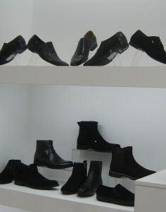
noticeable and starts selling herself. Therefore, the strategy of a successful retail company today is not in the widest assortment, but in the extremely accurate orientation of the assortment to the target group. Timely withdrawal from the assortment of irrelevant or clearly outdated items frees up additional space and makes it possible to better present the goods. But sometimes even this is not required, and it will be enough just to evaluate the effectiveness of the use of retail space. For example, in this photo it is noticeable that the lower shelf is almost free, which means that part of the shoes could be represented on it.
Paradoxical as it may seem at first glance, sales using the LIM principle increase: according to the results of the Triindl experiments, they increase by 17-20%, and in some stores they even double. How it works? The fact is that our attention, depending on the development of attention and memory, can hold at the same time about 7 (plus or minus two) units of information. That is, if 5-7 models are presented on the shelf, the buyer will notice them all. If 8-9, then perhaps it will notice, but maybe not in full. From 10-11, the buyer will have to isolate the very 5-7 models that he is able to capture attention. At the same time, the psyche quickly gets tired, and as a result, a person wants to leave the store faster.
A common mistake, especially in inexpensive shoe stores, is the unstructured presentation of models associated with the desire to fill the entire display space with goods. It seems that the seller wants to emphasize with such a calculation that “our prices are low, come and choose”. But the effect is often the opposite, and the buyer voices his impression as: “everything is the same, everywhere the same”. Such a layout does not allow the buyer to notice individual models and get a complete picture of the range.
Meanwhile, it is enough to group the goods according to similar models, and in the same space the buyer will no longer see a random pile of shoes, but separate groups, the number of which can be described.
However, sometimes it is recommended to deviate from the “correct”, orderly layout in order to add liveliness to the presentation. Nevertheless, here, too, we see that the models are grouped by style, and the classic parallel-perpendicular display is enlivened by "irregularities" that attract attention to themselves.
Also, you can just slightly disrupt the "correct" order of the goods on the shelves. In this photo, the shoes, standing at different levels, are turned at an angle of 45 degrees to one side and the other. With this product orientation, each level is "read".
Different forms of display and placement of goods at different levels also destroy the monotony and draw attention to the diversity of models. Thus, it turns out that the more differences between the models are created, the more units of goods are noticed by the buyer in the store. In other words, the presentation becomes all the more quality.
But the location of the goods at different levels does not always guarantee the close attention of the buyer. For example, such an arrangement of shoes, when the same amount of a homogeneous product is presented on all three levels of an island rack, on the contrary, “dilutes” attention. And, as a result, the bottom shelf is no longer readable.
Therefore, avoid monotony: different levels of a showcase imply a different design. When the minimum number of shoes was left on the bottom shelf, it began to attract the attention of the buyer with a rhinestone: the so-called focal point turned out.
And one more nuance: quality should be experienced emotionally. Visuals should create trust in the product and awaken the desire to purchase it. Then a person, when looking at a thing, has a vivid need for it. That is why it is so important to saturate the store space with emotional imagery. And instead of laconic inscriptions, as in this photo, you can use photo plots that create a mood and affect the emotions of the buyer. For example, a photo of a happy girl in the snow would be a good substitute for a red sign with the word "winter". The use of emotional photography aimed at the target group of buyers is called “intuitive merchandising”, And creates that psychological atmosphere in the store, which on an emotional level prompts the customer to purchase your goods.
| Please rate the article |
Materials on the topic
Should a shoe store spend money on digital screens?
Mistakes in the lighting of the sales area that spoil the impression of a shoe store
Technical aspects of display space and current trends in its design
Design rules for a shoe and accessories store
Pandemic-influenced visual merchandising transformation for shoe and accessories store
Popular
 Louis Vuitton opens a new factory in Italy
Louis Vuitton has opened its second shoe factory in Italy. After opening the first one in Fiesso d'Artico in Veneto, the LVMH flagship brand has just opened a new production site dedicated to this category of footwear in the industrial zone of Civitano in the Marche region. There is also another brand production facility in Tuscany, where bags and leather accessories are produced, writes fr.fashionnetwork.com.
 American buyers couldn't buy Birkin bags and sued Hermès
French fashion house Hermès is facing a lawsuit in California from two customers who were unable to purchase exclusive Birkin bags. The fashion house is accused of unfair commercial practices.
 We are ready for active development in the Russian market
Friedrich Naumann, CEO of the Tamaris brand, told Shoes Report about the company’s ambitious plans, business development in Russia and expansion of the retail network, and also shared details about new collections and launches.
 “Discount for repairs” of clothes and shoes in France supported workshops
The French have calculated the benefits of a program that encourages consumers to repair clothes and shoes by providing discounts on these services in certified workshops. The “repair discount” program began operating in France in November last year. Over the six months of operation of this program, the number of calls to repair shops in France increased 10 times and amounted to 250 repairs. The French saved 000 million euros, writes leparisien.fr.
 Coach turned to Big Data analysis and won the interest of a young audience
American handbag brand Coach has planned the success of its Tabby model among a younger audience, Generation Z, by turning to big data analysis, abandoning traditional and analogue tools, such as human intuition or the ability of any executive to sense “which way the wind will blow,” writes B.O.F.
 Why is it so important to work with customer reviews, analyze them and use them in your work?
Customer reviews are of great, invaluable importance when selling a product. However, many companies do not always understand this: they do not collect reviews, respond only to positive ones and do not work with negative ones. This is a big mistake and omission of the brand. In this article, together with SR digital marketing expert Tatyana Vasilyeva, we understand the intricacies and nuances of working with customer reviews and explain why it is worth paying attention to your customer reviews, and how this can increase your sales.
 The Euro Shoes@CAF exhibition will be held in Almaty
From March 11 to 13, the Euro Shoes@CAF (Central Asia Fashion) exhibition will be held in Almaty at the Atakent exhibition complex. The exhibition, which is the largest international event in the fashion industry in Central Asia, will present collections of clothing, shoes and accessories.
 New “dutik” from Rick Owens presented at the show in Paris
Strange bulky shoes are another trend of our troubled times, and it’s impossible to ignore. American designer Rick Owens presented voluminous inflated latex boots at a show in Paris, which, according to him, were created in collaboration with the young London designer Straighteye, who likes to experiment with architectural volumes.
 VAGA SHOES is a new participant in the Euro Shoes premiere collection
The Russian women's shoe factory VAGA SHOES will take part for the first time in the international exhibition of footwear and accessories Euro Shoes premiere collection in Moscow.
 Euro Shoes will start operating on February 19 in Moscow!
The winter session of the international exhibition of footwear and accessories Euro Shoes premiere collection will be held in Moscow at the Expocenter from February 19 to 22. The organizers promise the presence of all the main participants at the exhibition, as well as new names from Europe, Asia and Russia.
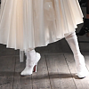 John Galliano and Christian Louboutin created the Tabi collection for Maison Margiela
Maison Margiela creative director John Galliano and French shoe designer Christian Louboutin released a shoe collaboration that was included in the Maison Margiela Artisanal spring 2024 couture collection. The design duo created six versions of the Tabi shoe. All shoe models in the collection have a split toe - a characteristic touch of the signature Tabi shoe model of the Maison Margiela brand. And Christian Louboutin gave the shoe its signature red sole.
 Euro Shoes starts in a month in Moscow!
There is less than a month left before the main exhibition of shoes and accessories in Russia - Euro Shoes Premiere Collection. The event will take place from February 19 to 22 in Moscow at the Expocenter, and, as always, in partnership with the largest international clothing exhibition in Russia, CPM Premiere Moscow.
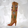 Christian Louboutin presented a collection in a cowboy style
At the Loubi Show in Paris, the French luxury brand Christian Louboutin presented its fall 2024 collection, following the trend - in the style of the Wild West. It included cowboy boots and rhinestone loafers.
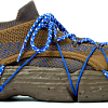 Camper has released innovative sneakers - designers
Spanish brand Camper's new Roku sneaker features six interchangeable components to create up to 64 different looks and color combinations. Roku means "six" in Japanese.
 Why Rendez-Vous and Yandex Lavka released a “bread bag”
Shoe retailer Rendez-Vous announced the launch of a spring collaboration with Yandex Lavka and released a roll that resembles the shape of a woman’s handbag. This “Bread Bag” is presented in the Yandex.Lavka application at a price of 249 rubles. On the product packaging there is a promotional code for 1000 rubles, which can be spent in the Rendez-Vous network.
 Fashion Week takes place in Moscow
Fashion Week takes place in the Russian capital. Events include fashion shows, markets where you can purchase clothes, bags and accessories, and a B2B Showroom for fashion industry professionals.
 Fashion trends Fall-Winter 2023/24 for commercial footwear purchases
Permanent contributor to Shoes Report. Elena Vinogradova, an expert in sales and purchases in the fashion business, prepared an overview of the trends for the autumn-winter 2023/24 season especially for us.
 MSCHF and Crocs launch "Big Yellow Boots"
Creator of the Big Red Boots, Brooklyn brand MSCHF has teamed up with American plastic clog and sandal brand Crocs for another oversized shoe. The new Big Yellow Boots will go on sale on August 9th.
 Five rules of professional lighting for a shoe store - something that is relevant in any season
When developing a lighting concept for shoe retailers, it is important to take into account not only the history of the brand, the architectural content of the premises, the target audience of the stores, but also the seasonality of the goods. With the onset of the cold season, client preferences change: bright weightless shoes are replaced by more massive models in discreet dark colors. Despite significant differences in summer and winter collections, the overall philosophy of the brand, its recognition should remain unchanged at any time of the year. Tatyana Ryzhova, an SR lighting expert in fashion retail, has identified five basic rules for a competent lighting concept for a shoe store for readers of the magazine, which will help to present winter assortment to customers in a winning way.
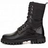 Bertsy: what to look for when choosing a model
Bertsy and tactical boots are becoming more and more relevant footwear, and not only because of the start of the hunting season. In Russia, there are several dozen enterprises producing this type of footwear. Oleg Tereshin, Deputy Chief Technologist of ZENDEN, told Shoes Report about the differences and features of ankle boots and what you should pay attention to when buying them in specialized retail and online.
 EURO SHOES presents an updated section of the GLOBAL SHOES exhibition with collections of shoe and bag brands from Asian countries
EURO SHOES premiere collection is expanding. Along with the traditional pool of leading European footwear brands from Germany, Spain, Italy and Turkey, several dozen footwear and bag brands from the Middle Kingdom will be presented in the GLOBAL SHOES section at the Moscow Expocentre from August 29 to September 1.
 I doubt and object: how to find an approach to difficult clients?
How good and serene would be the work of a salesperson if the customers were calm, cheerful, always knew exactly what they wanted, and bought, bought, bought! It is a pity that this is possible only in dreams. Therefore, we will not dream, but we will act. Together with Maria Gerasimenko, a permanent author of SR, we understand the doubts and objections of buyers and build a strategy for working with them. Our expert pays special attention to the two main objections of buyers, on which 82% of sales are lost.
 Two prominent Russian fashion designers Vyacheslav Zaitsev and Valentin Yudashkin passed away
One after another, two days apart, Vyacheslav Zaitsev and Valentin Yudashkin, outstanding fashion designers, whose work for the whole world was a kind of hallmark of fashionable Russia, left this world.
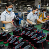 World Footwear Yearbook: Global footwear production reaches 23,9 billion pairs and is back to pre-pandemic levels
The Portuguese association of shoe manufacturers APICCAPS published the 13th edition of the international statistical bulletin World Footwear Yearbook for 2023, according to which in 2022 the production and export of shoes worldwide increased by 7,6% and 9%, respectively, and the world production of shoes reached 23,9 billion couples and returned to pre-pandemic levels.
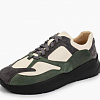 Rostov footwear brand Novak presented a collection of sneakers and sneakers
In the spring-summer 2023 season, the Rostov-on-Don shoe brand Novak presented a cute collection of sneakers and sneakers for every day. The upper of the shoe is made of genuine leather, suede, nubuck, the sole is made of light EVA.
 How to create selling visual content for online based on the identified unique selling proposition?
What is a USP (unique selling proposition) and what is it for? Why is the USP creation service in great demand among fashion retailers today? How to create a working USP? Answers questions and provides step-by-step guidance on how to define your unique selling proposition and work with it to increase online sales, Tatyana Vasilyeva, an SR expert in the promotion and development of fashion brands.
 Shoe educational program: what shoe soles are made of
“What is the difference between TEP and EVA? What does tunit promise me? Is PVC glue? What is the sole of these shoes made of? ”- the modern buyer wants to know everything. In order not to smash his face in front of him and be able to explain whether such a sole suits him in soles, carefully read this article. In it, process engineer Igor Okorokov tells what materials the soles of shoes are made of and what makes each of them so good.
 How to set prices that will earn
Some businessmen still confuse the concept of margin with the concept of trade margins and set prices for their goods, guided solely by the example of competitors. No wonder they go broke! Analyst at the Academy of Retail Technologies Maxim Gorshkov gives several tips and formulas with which you can set not only ruinous, but also profitable prices.
 Sales of shoes and accessories: effective techniques for business rhetoric
Which speech modules are effective in communicating with potential and current customers of shoe stores, and which are not, Anna Bocharova, a business consultant, knows.
 We form the salary of sellers: expert advice
“How do you charge your consultants for personal or general sales?” Is one of the most popular questions causing a lot of controversy and gossip on the online forums of retail business owners. Indeed, how to properly form the earnings of sellers? But what about bonuses, where to get a sales plan from, do employees allow them to buy goods at discounted stores? In search of truth, the Shoes Report turned to a dozen shoe retailers, but no company wanted to disclose its motivation system - the process of its development was too complicated and individual. Then we asked four business consultants, and finally became convinced that the topic of seller motivation is very complex, because even our experts could not come to a common opinion.
 The whole truth about Bayer. Who is he and how to become one?
Bayer is no longer a new, but still a popular and sought-after profession. It’s fashionable to be a buyer. Buyers are at the origins of the emergence and development of trends. If the designer offers his vision of fashion in the season, then the buyer selects the most interesting commercial ideas. It is on buyers that the policy of sales of stores and what, in the end, the buyer will wear depends on. This profession is surrounded by a magical fleur, often associated with a lack of understanding of what exactly is the work of a buyer.
 Technology Selling Issues
There is nothing worse than meeting the buyer with the words “Hello, can I help you with something?”, Because the seller works in the store just to help. Criticizing this well-established pattern of communication with the buyer, Andrei Chirkarev, business coach for effective sales and the founder of the New Economy project, shares the technology of truly selling issues with readers of Shoes Report.
 Fur, and not only: types of lining
In the production of winter footwear, various materials are used that are designed to retain heat and meet the requirements of consumers: natural sheepleather, artificial fur, artificial fur from natural wool and others. All types of lining fur have their own advantages and disadvantages. Let's consider the properties of each of them.
 Retail Arithmetic
Before you begin to solve specific problems, you need to find out how accurately all the leaders of your company understand the basic terminology of retail.
 How to fire a worker without tears, scandal and trial
Sooner or later, any manager is faced with the need to part with an employee. Properly and on time the dismissal procedure will save the company money, and the boss himself - nerves and time. But why sometimes, knowing that a break in relations is inevitable, we put off the decision for months?


