How to show the price: nine important rules

Marina Polkovnikova - the owner of the visual merchandising agency in the field of fashion VM-consulting, a merchandising and store design consultant with 12 years of experience, a member of the jury of the annual ProFashion Awards. Lecturer at the Art & Image Institute, trainer at business schools in Moscow, Novosibirsk, Irkutsk, Izhevsk, Bryansk and Perm. Regular participant in trainings and seminars in the field of merchandising, lighting solutions and staff training. Participant of TV programs and Fitness Summit 2013 as an invited expert.
VM-consulting Is a visual merchandising agency for fashion stores. Provides a wide range of services from window dressing and merchandising audit to the reconception of a VM store and staff training. More than 1000 clients use the agency's products, more than 350 unique showcases have been created and put into commercial operation, more than 500 people have been trained, more than 60 stores have been opened.
www.vm-consulting.ru
Sellers and buyers are often concerned about how the expected price matches the actual value of the product. I often hear phrases like "This is too expensive!" or "How cheap ... even suspicious!" Similar thoughts appear in the mind of a visitor when the store design and layout do not correspond to the real price of the product being sold. To prevent this from happening, it is important not only to match the appearance of the store with the segment in which it operates, but also to correctly work with price tags, price holders and POS materials. In this article, I'll try to explain the basic rules to follow when working with these elements of visual merchandising.
Rule # 1: The price must always be on the label. It doesn't matter in what price segment your store operates, the buyer should be able to figure out the price of the product without the help of the seller. The price tag hidden in the back of the boot, on which everything is written - from the sole material to the batch number - except for the most important thing, makes the buyer feel awkward and distrustful of the store. "Is the price so high that they don't want to scare me with it?" or "What is wrong with this product if the store is hiding its value?" - approximately such thoughts may arise in the mind of a customer, and none of them adds status to the store.
Rule # 2: The price should occupy from 20% to 40% of the price tag. This is the optimal area for the price to be distinguishable and readable against the background of other additional information, such as the composition of the product or the manufacturer. In this case, you should not give the price more space, otherwise additional information will not be read. Anything that the customer cannot easily see irritates him and makes him transfer irritation to the product itself or even the store as a whole.
Rule # 3: The higher the price segment of a product, the lower the price on the label should be. The prices, written in large and bright colors, are typical of low-price segment stores. The buyer is already accustomed to this, and subconsciously perceives a large price as a profitable, low, wasteful one. But cheapness is not the motive for buyers of shoes in the middle price segment. Therefore, do not confuse store visitors with large prices. Let the price on the labels take no more than 30%.
Rule # 4: It is necessary to show the cost of the goods in the storefront. The client should be able to understand from the very start whether the store is interesting to him, and in this he is helped by the prices of indicator items placed in the window. But there is an exception to this rule: premium brands may not indicate the cost of the product. It is not supposed to matter to their clients.
Rule # 5: The size of the price tag in the display case matters. The price holders are placed information about prices for a group of goods, for example, presented on mannequins. The same rule of perception applies here: more means cheaper, less means more. Therefore, the lower the price segment of the product, the larger the size of the price holder should be. For stores in the middle price segment, the optimal size is A5.
Rule # 6: During the sale period, the price difference should be indicated on the price tag. To do this, the previous price is crossed out, and the new price is written in a larger number next to it. Do not neglect this rule, because it really works thanks to its clarity.
Rule # 7: POS-Materials should be as simple as possible. Perfectly designed POS materials contain a minimum of text written in bright, contrasting type, and briefly convey one idea, for example, "1 + 1 = 3". Visitors do not read information media if they contain too much information, therefore, the simpler and clearer the message on the POS media, the greater its chance of being read.
Rule # 8: In a small store, it is permissible to use no more than 3 types of information carriers. We are talking about information carriers informing about a trade proposal - the arrival of a new collection, promotions, discounts, sales. If your store occupies no more than 100 square meters, do not overload it with different types of such media, otherwise the buyer will get confused and, annoyed, will leave without buying.
Rule # 9: Don't have discount information in the checkout area. Despite the fact that the checkout is one of the most visited areas of the store, promoting discounts here is not only pointless, but also harmful. Firstly, the buyer already pays for the product, so information about the promotion is not relevant for him. Secondly, having seen the information about discounts, the buyer can abandon an almost perfect purchase, even if it is from a new collection. Don't tempt the client!
| Please rate the article |
Materials on the topic
Should a shoe store spend money on digital screens?
Mistakes in the lighting of the sales area that spoil the impression of a shoe store
Technical aspects of display space and current trends in its design
Design rules for a shoe and accessories store
Pandemic-influenced visual merchandising transformation for shoe and accessories store
Popular
 Coach turned to Big Data analysis and won the interest of a young audience
American handbag brand Coach has planned the success of its Tabby model among a younger audience, Generation Z, by turning to big data analysis, abandoning traditional and analogue tools, such as human intuition or the ability of any executive to sense “which way the wind will blow,” writes B.O.F.
 IDOL updates the concept
The IDOL brand, part of the Melon Fashion Group portfolio, opened the first flagship in an updated concept in the Aviapark shopping center in Moscow.
 Seven “sins” of the shoe business. How do owners harm the company with their own hands?
Why is Company X able to create a strong, profitable brand, but Company Y is struggling to make ends meet? Many people prefer to attribute success to luck, luck, or the support of strong patrons. And few people ask themselves the question: “What am I doing wrong?” Moreover, many entrepreneurs begin to harm their business from the first day of its opening. In this article, together with SR expert in the field of fashion business management and development, Maria Gerasimenko, we will look at the 7 main “sins” that business owners commit using specific examples.
 Current techniques in lighting a shoe store
Today, walking through the galleries of shopping centers, we see a variety of formats of offline stores. New concepts of retail spaces attract with an individual, memorable design. In a certain sense, they are an element of the show, a tool through which the buyer receives a new and interesting experience. Together with SR expert in the field of lighting technology in retail, Tatyana Ryzhova, we will look at current lighting design techniques for modern shoe stores, which we will see more and more often in new retail outlets in the near future.
 Louis Vuitton opens a new factory in Italy
Louis Vuitton has opened its second shoe factory in Italy. After opening the first one in Fiesso d'Artico in Veneto, the LVMH flagship brand has just opened a new production site dedicated to this category of footwear in the industrial zone of Civitano in the Marche region. There is also another brand production facility in Tuscany, where bags and leather accessories are produced, writes fr.fashionnetwork.com.
 The Euro Shoes@CAF exhibition will be held in Almaty
From March 11 to 13, the Euro Shoes@CAF (Central Asia Fashion) exhibition will be held in Almaty at the Atakent exhibition complex. The exhibition, which is the largest international event in the fashion industry in Central Asia, will present collections of clothing, shoes and accessories.
 Euro Shoes will start operating on February 19 in Moscow!
The winter session of the international exhibition of footwear and accessories Euro Shoes premiere collection will be held in Moscow at the Expocenter from February 19 to 22. The organizers promise the presence of all the main participants at the exhibition, as well as new names from Europe, Asia and Russia.
 American buyers couldn't buy Birkin bags and sued Hermès
French fashion house Hermès is facing a lawsuit in California from two customers who were unable to purchase exclusive Birkin bags. The fashion house is accused of unfair commercial practices.
 Why Rendez-Vous and Yandex Lavka released a “bread bag”
Shoe retailer Rendez-Vous announced the launch of a spring collaboration with Yandex Lavka and released a roll that resembles the shape of a woman’s handbag. This “Bread Bag” is presented in the Yandex.Lavka application at a price of 249 rubles. On the product packaging there is a promotional code for 1000 rubles, which can be spent in the Rendez-Vous network.
 Camper has released innovative sneakers - designers
Spanish brand Camper's new Roku sneaker features six interchangeable components to create up to 64 different looks and color combinations. Roku means "six" in Japanese.
 Turkish brand Vaneda on Euro Shoes
Street style, sport, outdoor, military – the main style directions of footwear of the company from Turkey
 Christian Louboutin presented a collection in a cowboy style
At the Loubi Show in Paris, the French luxury brand Christian Louboutin presented its fall 2024 collection, following the trend - in the style of the Wild West. It included cowboy boots and rhinestone loafers.
 Fashion Week takes place in Moscow
Fashion Week takes place in the Russian capital. Events include fashion shows, markets where you can purchase clothes, bags and accessories, and a B2B Showroom for fashion industry professionals.
 We are ready for active development in the Russian market
Friedrich Naumann, CEO of the Tamaris brand, told Shoes Report about the company’s ambitious plans, business development in Russia and expansion of the retail network, and also shared details about new collections and launches.
 Fashion trends Fall-Winter 2023/24 for commercial footwear purchases
Permanent contributor to Shoes Report. Elena Vinogradova, an expert in sales and purchases in the fashion business, prepared an overview of the trends for the autumn-winter 2023/24 season especially for us.
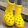 MSCHF and Crocs launch "Big Yellow Boots"
Creator of the Big Red Boots, Brooklyn brand MSCHF has teamed up with American plastic clog and sandal brand Crocs for another oversized shoe. The new Big Yellow Boots will go on sale on August 9th.
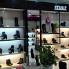 Five rules of professional lighting for a shoe store - something that is relevant in any season
When developing a lighting concept for shoe retailers, it is important to take into account not only the history of the brand, the architectural content of the premises, the target audience of the stores, but also the seasonality of the goods. With the onset of the cold season, client preferences change: bright weightless shoes are replaced by more massive models in discreet dark colors. Despite significant differences in summer and winter collections, the overall philosophy of the brand, its recognition should remain unchanged at any time of the year. Tatyana Ryzhova, an SR lighting expert in fashion retail, has identified five basic rules for a competent lighting concept for a shoe store for readers of the magazine, which will help to present winter assortment to customers in a winning way.
 I doubt and object: how to find an approach to difficult clients?
How good and serene would be the work of a salesperson if the customers were calm, cheerful, always knew exactly what they wanted, and bought, bought, bought! It is a pity that this is possible only in dreams. Therefore, we will not dream, but we will act. Together with Maria Gerasimenko, a permanent author of SR, we understand the doubts and objections of buyers and build a strategy for working with them. Our expert pays special attention to the two main objections of buyers, on which 82% of sales are lost.
 EURO SHOES presents an updated section of the GLOBAL SHOES exhibition with collections of shoe and bag brands from Asian countries
EURO SHOES premiere collection is expanding. Along with the traditional pool of leading European footwear brands from Germany, Spain, Italy and Turkey, several dozen footwear and bag brands from the Middle Kingdom will be presented in the GLOBAL SHOES section at the Moscow Expocentre from August 29 to September 1.
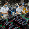 World Footwear Yearbook: Global footwear production reaches 23,9 billion pairs and is back to pre-pandemic levels
The Portuguese association of shoe manufacturers APICCAPS published the 13th edition of the international statistical bulletin World Footwear Yearbook for 2023, according to which in 2022 the production and export of shoes worldwide increased by 7,6% and 9%, respectively, and the world production of shoes reached 23,9 billion couples and returned to pre-pandemic levels.
 Rostov footwear brand Novak presented a collection of sneakers and sneakers
In the spring-summer 2023 season, the Rostov-on-Don shoe brand Novak presented a cute collection of sneakers and sneakers for every day. The upper of the shoe is made of genuine leather, suede, nubuck, the sole is made of light EVA.
 Jacquemus x Nike collaboration released
The second collaboration between Jacquemus and Nike, which has been talked about so much, is finally out. The appearance of the couple for many was a surprise. The model of Nike Air Force 1 sneakers, which was taken as the basis of the new collection, has undergone significant changes.
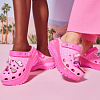 Crocs releases a collaboration with Barbie
If Barbie ditched heels and wore crocs, they would be pink. It was this collection in pink that was released by the American brand of plastic clogs Crocs, for the release of the film "Barbie" in the United States.
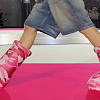 Japanese BAPE takes to the catwalk MSCHF Big Red Boots
The story of Brooklyn brand MSCHF's oversized rubber boots continues. The last time they made noise in the auditorium was at the Rick Owens menswear show. Now they have already appeared on the podium.
 Shoe educational program: what shoe soles are made of
“What is the difference between TEP and EVA? What does tunit promise me? Is PVC glue? What is the sole of these shoes made of? ”- the modern buyer wants to know everything. In order not to smash his face in front of him and be able to explain whether such a sole suits him in soles, carefully read this article. In it, process engineer Igor Okorokov tells what materials the soles of shoes are made of and what makes each of them so good.
 How to set prices that will earn
Some businessmen still confuse the concept of margin with the concept of trade margins and set prices for their goods, guided solely by the example of competitors. No wonder they go broke! Analyst at the Academy of Retail Technologies Maxim Gorshkov gives several tips and formulas with which you can set not only ruinous, but also profitable prices.
 Sales of shoes and accessories: effective techniques for business rhetoric
Which speech modules are effective in communicating with potential and current customers of shoe stores, and which are not, Anna Bocharova, a business consultant, knows.
 We form the salary of sellers: expert advice
“How do you charge your consultants for personal or general sales?” Is one of the most popular questions causing a lot of controversy and gossip on the online forums of retail business owners. Indeed, how to properly form the earnings of sellers? But what about bonuses, where to get a sales plan from, do employees allow them to buy goods at discounted stores? In search of truth, the Shoes Report turned to a dozen shoe retailers, but no company wanted to disclose its motivation system - the process of its development was too complicated and individual. Then we asked four business consultants, and finally became convinced that the topic of seller motivation is very complex, because even our experts could not come to a common opinion.
 Technology Selling Issues
There is nothing worse than meeting the buyer with the words “Hello, can I help you with something?”, Because the seller works in the store just to help. Criticizing this well-established pattern of communication with the buyer, Andrei Chirkarev, business coach for effective sales and the founder of the New Economy project, shares the technology of truly selling issues with readers of Shoes Report.
 The whole truth about Bayer. Who is he and how to become one?
Bayer is no longer a new, but still a popular and sought-after profession. It’s fashionable to be a buyer. Buyers are at the origins of the emergence and development of trends. If the designer offers his vision of fashion in the season, then the buyer selects the most interesting commercial ideas. It is on buyers that the policy of sales of stores and what, in the end, the buyer will wear depends on. This profession is surrounded by a magical fleur, often associated with a lack of understanding of what exactly is the work of a buyer.
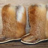 Fur, and not only: types of lining
In the production of winter footwear, various materials are used that are designed to retain heat and meet the requirements of consumers: natural sheepleather, artificial fur, artificial fur from natural wool and others. All types of lining fur have their own advantages and disadvantages. Let's consider the properties of each of them.
 Retail Arithmetic
Before you begin to solve specific problems, you need to find out how accurately all the leaders of your company understand the basic terminology of retail.
 How to fire a worker without tears, scandal and trial
Sooner or later, any manager is faced with the need to part with an employee. Properly and on time the dismissal procedure will save the company money, and the boss himself - nerves and time. But why sometimes, knowing that a break in relations is inevitable, we put off the decision for months?


